An Introduction to the Photoshop Brush Engine

The Photoshop brush engine allows you to create your own brushes, starting from a brush tip shape that can be just a circle or a sampled image. This shape is repeated along the stroke. To avoid this looking boring, Photoshop gives you some tools to vary these shapes along the line to get a more complex look. Especially when working with a pressure sensitive stylus there are great ways to get a natural feel to your brushwork.
How to get started
Open a new blank file where you will be able to test your new brush.
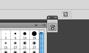
Select the Brushtool (or press B) and than click on the “Toggle the Brushes palette” button that is shown on the image on the right (or press F5).
The window that opens is the brushes palette. Here you will create and edit your brushes.

How The Brush Settings Work
The brush engine of Photoshop is based on brush marks. These brush marks can have different shapes. They can just be circles or sampled monochrome images, where the black parts are the parts with the most opacity.
If you draw a line either with your digitizing tablet or just with a mouse, there will be drawn brush marks along this line at an certain spacing interval.
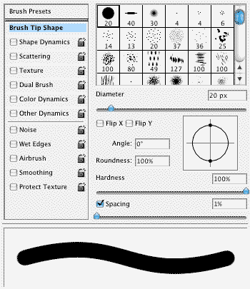
In the brushes palettes the first two menu-items, Brush Presets and Brush Tip Shape, just determines the basic shape of your brush marks.
The others; Shape-Dynamics, Scattering, Texture, Dual Brush, Color Dynamics and Other Dynamics; offer you the tools to modify the way these marks are drawn on the canvas.
Jitters
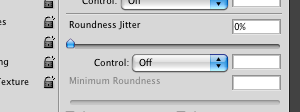
Some of the modifications you do with a brush are based on so called jitters. jitters can work in 2 different ways.
1. A jitter can randomly change a certain value, like the size of the brush, for every brush mark, that is drawn. To use a random jitter just slide up the scroll bar below it.
2. In addition a jitter can modify a value with fade or by pen pressure, pen tilt or the stylus wheel. To select one of these choose it from the drop-down menu Control.
If you choose a control, your graphics pad doesn’t support, there will be an exclamation point left of the drop-down menu warning you.
Fade is the only one of these four values, that doesn’t depend on a graphics tablet. It just increases the value it’s used for with every mark of the stroke you draw, until it reaches the minimum value. How many marks are drawn is determined by the number next to the drop-down menu.
Pen Pressure is the classic setting and supported by most graphics tablet. It let the value it is used for depend on how much you impress your stylus.
Pen Tilt is measuring the angle in which you hold your stylus to the graphics tablet. The straighter you hold it, the bigger this value will get. The more you pitch it towards the tablet the smaller it gets. Pen pressure is only supported by the more improved graphics tablet like the Intuos or Cintq Series.
Stylus Wheel resembles a mouse wheel and comes only with the Wacom Intuos Airbrush Pen. Turning the wheel will modify the value while you are drawing. This is for example great to adjust the size of your brush.
Some Jitters also have a minimum, which determines the smallest value this jitter can create (for example the smallest brush size). The maximum of a jitter depends on the original value of the option that is jittered. If for example your opacity is set to 50% and the minimum opacity is set to 20%, an opacity jitter can only create brush marks with an opacity between these two values.

Brush Presets
Here you can choose an already existing brush to start. This not just includes every option of a preset brush. If you want to start from the scratch you should just select a simple round brush.
Brush Tip Shape
This is were you really start to set up your own brush. In the top of this menu you can choose the basic shape of your brush. This can be a simple circle, a square or a more natural shape by using a sampled image.
The Diameter is just the basic size of your brush that can later be changed as always.
Flip X and Flip Y is only of interest if you are using a asymmetrical brush. It will flip the texture of it.
Angle turns your brush.
Roundness compresses the shape of your brush by specifies the ratio between the brush’s short and long axes. If you are using a round brush it gives you an ellipse. For any other brush it just makes it smaller in one axis.
Hardness can only be used for the standard round or elliptic brush, not for sampled brushes. Decreasing the hardness will blur the edges of the circle, giving you a softer brush.
Spacing is a good way to see how the brush engine of Photoshop works. Increase the spacing and the single brush marks will be drawn apart. The smaller the spacing, the more the brush marks will overlap each other. If you are just working with a round brush it is the best to decrease the spacing but when working with a textured brush this could probably cause a overlapping of the texture. If you are having performance issues you can also try to increase the spacing. Deactivating Spacing will make the space between the single brush marks depend on how fast you move the brush.

Shape Dynamics
The size jitter (left: pen presure, right: random) is one of the most common Jitters, especially when used with pen pressure. It specifies how the size of brush marks vary in a stroke.

The angle jitter (left: pen presure, right: random) allows you to determine the angle of the brush marks.

The roundness jitter (left: pen presure, right: random) works the same way as the roundness from the brush tip shape menu, just that it lets you vary it.

Scattering
With Scatter the position of you brush tip is randomized around its original position. If Both Axis is enabled every single brush mark will be randomly scattered around a certain radius depending on the scatter. If Both Axis is disabled it will only scatter in the right angle from your line. If you choose a control for scatter you must set it higher then 0%, otherwise it won’t do anything.
If you increase the Count there will be more Brush marks scattered around every spacing interval of the stroke. This value makes only sense used in combination with scatter. It works different than spacing. Because spacing determines how much space is left between every interval. The count determines how often your brush marks is drawn on each of these intervals. Without scatter all these brush marks of one interval would be drawn over each other.

Texture
The texture menu gives you the possibility to add more structure to you brush, by laying a texture over your brush.
The small graphic at the top is the texture that will be used.
Scale determines how big the texture will be. This is independent from your brush size. The scale of the texture will always be the same, no matter how big your brush is. This allows you do create some kind of canvas effect with texture.
Mode defines in which way the texture will be laid over your brush. It is hard to explain the different modes, so its best to try them out. I like Hard Mix.
Depth lets you adjust how strong the texture will affect your brush. A maximum depth can lead to spots of no opacity in your brush while no depth won’t affect your brush at all.

Dual Brush
This is the most complex option, but also offers you the most interesting effects.
In this menu you can choose a second Brush and define certain properties for this brush (they work the same way as for a normal brush).
This Brush then will be overlayed in one of the same modes as you could choose for texture over your original brush.
The effects that can be created by this menu are heavily effected by what combination of brush tips you choose, what mode you choose, but also scattering one or both of the Brushes influences the outcome. You should just play around with the options and try different combinations.

Color Dynamics
With the Foreground/Background Jitter you can switch between your foreground and your background color. If used with pen pressure this works pretty much like opacity, just that you have different colors depending on your pressure, instead of a lower or higher opacity. If you use a random jitter this will give your brush strokes some nice effects, depending on what colors you choose for the fore- and background.

Similar effects can be created with the Hue,Saturation and Brightness Jitters. These just randomly vary the values, giving you a more diversification in your color.


Purity is only of use if you combine it with the hue jitter. The higher the purity the more saturated the average color will be. 100% purity means the color is completely saturated. This works a little bit like a minimum slider. Without a hue jitter this just changes the saturation of your foreground-color.
Other Dynamics
The Opacity Jitter is probably the most used of all these options. It just determines the opacity of your Brush. Used with Pen Pressure, this gives you the classic, pressure sensitive Brush. If you use the blur or sharpen tool instead of a normal brush tool, opacity becomes Strength which will determine how strong these tools work. For the dodge and burn tool this becomes Exposure.

Flow Jitter works a bit different than opacity. While opacity influences the covering power of the whole brush stroke, meaning no point of a brush stroke can be more opaque than the value you set it, flow just defines the covering power of each brush mark. This means even with 10% Flow you can get achieve opacity of 100% by just painting over the same position for some time.

Other Brush Options
If you activate Noise there will be something like a noise filter laid over your brushstrokes. This makes only sense for brush tips with grayscales.

Wet Edges makes the inner parts of your brush a bit more opaque and the edges darker. Because you can’t adjust this effect it is a little bit impractical but can create nice effects.

The Airbrush gives you the possibility to draw new brush marks even when you are not moving your brush and just hold it in one place. This works independently form flow but can be combined with it.

If you have the problem that your brushe strokes are too angular when you drawn a curve to fast you should activate Smoothing, which will smooth your curves, but also decrease your performance a bit.

Protect Texture is only useful if you use the tool presets. It keeps the same texture for all presets, that are saved with this option.
A little bit about me
My name ist Marcus Blättermann.
I’m majoring in communication design and work as a freelancer for illustration, print- & webdesign.
What you should do next
Don’t forget to follow me on Twitter. You should also check out my Portfolio.