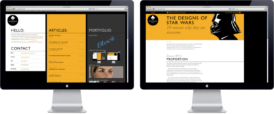
essenmitsosse Redesign
2009-08-17
After several redesign attempts over the last few years I finally ended up with something I’m happy with. I fought a long time with myself to find something that’s neither boring to look at nor overpowering the content. In the end I came up with a strong color scheme, that catches the attention of the viewer and than steps back when the content starts. Also note how the design can adjust to different screen sizes, while the content itself has a fixed width.
If you want to see the new design in all its glory, just surf around this website.
A little bit about me
My name ist Marcus Blättermann.
I’m majoring in communication design and work as a freelancer for illustration, print- & webdesign.