The Designs Of Star Wars 10 reasons why they are awesome
Star Wars didn’t just became famous for its story or special-effects. The role of its groundbreaking designs shouldn’t be underestimated. Here are 10 reasons why the concept arts are masterpieces and what they can teach you about good concept-art.
Reason №10 Proportion
The effects of good proportions seem to be pretty subtle, but well balanced and harmonic proportions can make the difference between a good and a bad design
Most people would say that they never noticed “good proportions” in Star Wars, but it isn’t important to make them mind-blowing, it just suffices to avoid messing them up (which is hard enough). Still you can greatly convey some things like scale via proportions.
If you want to know what the designs would look like if the concept artists would have failed on the proportions you should take a look at some merchandising products, which often alter the proportion, for example to let action figures fit in them.

AT-AT
The All Terrain Armored Transport is a good example of how to convey a sense of scale through proportions. Even without an object of comparison you can guess that they must be pretty large due to their long legs and the ratio between the head-cockpit and the body.
To see what happens if you screw up the proportions and how this affects the look of the whole thing just have a look at this toy AT-AT or this one.

Millenium Falcon
There are many interesting things about the proportions of the Falcon. The fuselage is extremely flat, and the cockpit is rather small. This creates a great suspense and gives the ship a unique look. It also conveys the scale of the ship really good.
How well balanced these proportions are, can be seen if you for example just extend the cockpit a little bit, like on this Millenium Falcon toy. The look and the sense of scale changes completely and the suspense is completely destroyed.

Sandcrawler
The proportions of the Sandcrawlers are playing with our experiences. Normal track vehicles are rather flat and have a low barycenter. But this one is just a huge, massive block sitting on four comparatively small tracks, which gives the Sandcrawler a great feeling of mass and a thrilling instable look. Which is intensified even more by the slightly overhanging cockpit.
It just lives up to its name by looking like a massive vehicle that really crawls through the sand. And this is achieved nearly completely by mere proportion.
Reason №9 Clear Forms
Clear form doesn’t have to mean simple design. The designs in Star Wars are just an great example for this. No matter how many small details and attachments there are, they never distract from the overall form, at best they support it.
This makes sure that the look doesn’t have to rely on detail but works also from a great distance.

Star Destroyer
In fact its just an triangular arrow with a flat cuboid on it. Over this one is another longish cuboid. And on top of that are two small bowls.
All forms of the Imperial Star Destroyer are just following a hierarchy and there are no two forms which compete which each other. This hierarchy allows all these little details while neither distracting from the overall look and the dynamic of the forms, nor looking like a simple form upon which details are affixed.

Death Star
How to depict a massive moon-sized battlestation that is powerful enough to blow up an entire planet? By making it look like a planet. Build of steel. No other form could convey the unbelievable size and power of this, than the simplest of all forms. A Sphere.
Without any attachments, towers, bridges or anything else setting itself apart, there is nothing that could give you a sense of scale, which seems to be the best way to make something look mind-boggling huge.

TIE-Fighter
A sphere with two flat panels on both sides. These simple forms give the TIE-Figher it’s unique and recognizable look.
It’s not good though it’s simple, it’s good because it’s simple.
Reason №8 Contrast
Contrast isn’t restricted to the contrast between light and dark or between colors. There can be all kinds of contrasts: big – small, thick – thin, hard – soft, round – angular, soft – rough, opaque – transparent, plane – voluminous and so on.
Great design always depends on some kind of contrast and contrast can be found nearly everywhere. Important is just how you use it. The best way to convey something really strong is to put its opposite next to it. The darkest black will be achieved with white besides. Contrasts are also a great way to avoid something look boring.

Boba Fett
I wouldn’t dare to say that Boba is such a cool badass because of all the contrast, but there is a lot of contrast going on, which might at least explain why he looks so cool. His armor is made of all different materials and colors. He has this clumsy helmet contrasted by the small antenna on one side and the slender top of his jet-pack.
All this gives him a pretty complex look that seems to be a stuffed together on all his adventures.

Mon Calamari Star Cruiser
Though it looks like there is little contrast in the Mon Calamari Star Cruisers, because they are made almost completely of rounded forms, their design works nearly by sheer contrast.
Foremost the forms are contrast to each other by their different size, than there is the contrast between curved forms and the edges where they intersect each other. This overall cohesive shape again is contrasted by the bridges and towers sticking out of it.

Cloud City
Cloud City just has this majestic look. Regardless that it’s so huge and massive it still looks like it’s really floating in the clouds. This is achieved through the extreme contrast between the enormous, heavy, flat disk at the top and this slender pole at the bottom that looks like it never could hold the weight of its top.
This tricks our brain to asume, that if the pole doesn’t look like it could support the top, than it must be floating.
Reason №7 Variations If Ideas
A good way to make fictional designs more believable is to avoid making them look random. A good way to do so is giving them some kind of background and connecting them with each other.
In Star Wars this is done especially for the Imperial forces, with designs that build up on each other, making them look like they where from same line. This not just adds to their credibility but also gives them much more depth. In addition it contrasts to the Rebells, whose crafts and uniforms look much less organized and more like they were stuffed together from different sources.

Stormtroopers & Imperial Pilots
Everybody knows the classic Stromtrooper Uniform, but if you look closer, you will notice, that parts of their uniforms are picked up by other imperial forces. While some part of the standard Stromtrooper design is always obtained, some parts of the armor are altered for the differend professions to make them more suitable.
But overall, all these designs create a consistent look for the Imperial forces, increasing the recognizability and suggesting that there must be some kind of organizational structure. Furthermore, giving every soldier and pilot the same “face”, no matter what they do, adds to the impression of a faceless army where a single person is of no significance, like in an ant colony.
There is a great Article on IGN called The Many Looks of the Imperial Stormtrooper

TIE-Series
The different TIE-models push the idea of altering a basic design even further. As already mentioned the look of the basic TIE-Fighter is pretty simple, making it easier to change details while maintaining the look and the recognizability.
This strengths the feeling, that the design of these starfighters isn’t just random. It makes it look like the concept of the TIE has really been developed by some starfighter-designers at Sienar Fleet Systems, has proved itself successful and was used again and altered slightly to fulfill other purposes.
But you should also notice that you first need to really establish a concept before you can alter it. If in the first scene of Star Wars there would already be 3 different kinds of TIEs, and in the next scene 4 others, it would clearly lose its impact.
Reason №6 Functional Design
If you design anything fictional, it should fulfill at best two things: It should look cool and it should look like it could work or at least make sense.
It’s pretty easy to design something that just looks cool, but if it creates the feeling that it wouldn’t be practical to actually use it, this will make it much less believable. And believability is pretty important for fictional things.
Plus if something fantastic looks like it would actually work, it becomes even more fantastic.

Rebell Blockade Runner
The Corellian corvette emphasis a look, that feels like it was designed for pure functionalty. Form follows purpose. There is no bodywork to shape it into something that looks good. The whole form is defined by its single components like the engines and the bridge. In addition there is no reason for an aerodynamic design, since you don’t need something like this in space.
This generates a look, that fells like it was only designed to do its work, not to win a contest for the best looking spaceship and thus makes it so believable.

R2-D2
Unlike the Blockade Runner an R2-droid isn’t only used for pure practicle things like transportation. He is more like Personal Computer or a PDA. In fact he could be called something like a status symbol, thence he has to look good.
This is reflected in his design which much more emphasizes a clear form. Nearly all the tools and utilities are hidden inside the casing of the droid making him something like an iMac or an Swiss Army Knife on Wheels. He has to function, but he also should look good. In the world of Star Wars he is something like a design object, still this good look fulfills a purpose and isn’t there for its own sake.

Jabba The Hutt
Jabba is a good example for what happens if you use the freedom a fictional world gives you and create something that intentional doesn’t work.
He is a powerful crime lord but his arms are barely long enough to reach his mouth and his body is to fat to move on his own. But this doesn’t weaken the believe in his power. It even strengthens it. It is his preposterous look that gives him an intimidating appearance. You subconsciously assume, that if somebody is physically so feckless and yet such a powerful crime lord, there really must be something that grants his power. And you wouldn’t want to find out what.
His physical weakness emphasis the political power he must possess.
Reason №5 Dirty/Used Look
One of the most revolutionary things about Star Wars when it came out was, that the things in the movies did look like they were used. Everything was dirty, sooty and worn-out. Before Star Wars it was more common for science-fiction-movies to look clean and futuristic. This look, that George Lucas called a “used universe”, heavily supports the believability of the Star Wars universe.

Slave 1
The Slave 1 is just one example, representing most ships in Star Wars. It’s dirty, dented, sooty, worn, the paint chips off and there are traces of wear all over.
The whole look of this craft shows that it has been used and that its owner had more important things to do than polishing. This used look not just makes the thing more realistic, it tells a story. It brings the ship to life. You can really see that it has underwent several episodes.
Today this look is pretty common, but in the 1960s it was a revolution and it adds enormously to the believability of Star Wars.

Imperial Interior
Making things dirty gives opens up another great opportunity. Making things clean. If everything in the movies would be clean you just wouldn’t mind. Maybe you’d be bored by it but nothing more. But by showing that there is really dirt in this universe, they are putting much more emphasis on the things that are clean.
The clean and sterile look of the Imperial forces only works because off all the other dirt in the movies. Only by this it can really convey its look and feel of a cold military force that don’t even has to get its hands dirty when blowing up an entire planet.

Tusken Raiders
The Tusken Raiders do something great for the overall feel of Star Wars. They show you, that not everything in this universe is futuristic and technological-advanced. Even in a world with Laser canons, Holograms and Hyperspace Drives, there are still primitive tribes.
But their clothing isn’t just made of simple, savage materials. It seems like they use some simple technology, like their face-mask. But this doesn’t make them look high tech. The worn-out look of their clothing that clearly shows signs of handcraft and the manufacturing process gives them the feeling of a tribe that is just using some outdated stuff or something like this.
Reason №4 Breaking the rules
There are many rules on what is (supposed to be) good design and how to do it. I already told you 6 of them and how they where used in Star Wars to produce great designs. So here’s another rule:
Screw the rules!
There is nothing more boring than a standard design that has been used several times before, so do something unexpected. Sometime it’s just best to do something unusual, or even something you were told never to do.
Star Wars makes great use of this. There are so many designs that are completely different to anything that had been there before (and after). Even small design choices can be approached in an usual way, making things more interesting.

Nebulon-B escort frigate
This ship isn’t really well-know, but I just love the unusual look of it (note, that the bigger part ist the front of the ship), resembling an reversed gun. Nevertheless it still looks believable. The whole thing doesn’t seem to be that impressive, yet it isn’t that easy to do something that can be identified as a space ship without looking like anything we associate with a space ship.

Chewbacca
Chewbacca is a co-pilot and looks like a huge dog-bear. On the one hand this is totally ludicrous. On the other hand he is one of the most favored characters. On the third hand this makes perfectly sense, because he wouldn’t be such a great and beloved character if he would have been just a normal human co-pilot.
Reason №3 Design inspired by existing things
Most people don’t notice this, but it is used pretty often throughout Star Wars. Many of the designs are based upon things that really exist. This can have two advantages: it can give the object a certain feeling because it creates an associativity if it is common or it can just make use of an established design that is known for creating a certain look or feeling.
Blasters
Did you found the weapons of Star Wars somehow familiar? Like you’ve seen them before? That’s not by accident. All small arms in Star Wars are based upon existing weapons from the real world.

The weapon on the top is a Mauser C-96 which was manufactured from 1896 to 1936 in Germany and was used amongst others by Winston Churchill and the German Army.
The weapon on the bottom is a DL-44 heavy blaster pistol which was manufactured in the time of the Galactic Civil War by BlasTech Industries and was used by Han Solo.
Do you notice something about them? For Star Wars they just took Mausers and put some muzzle and grip accessories on it and mounted a rifle scope on the top.
Somehow all this is also a part of George Lucas “used univers”. Because they used weapons that actually really work they made sure that they look believable and this added to their credibility.
Here is a list of other weapons used in Star Wars that are based on actual weapons:
| Star Wars Weapon | Used by | Real Weapon |
|---|---|---|
| Defender sporting blaser | Princess Leia | Margolin .22 MTs target pistol |
| Ion Blaster | Jawas | Lee-Enfield |
| E-11 blaster rifle | Stormtroopers | Sterling L2A3 SMG |
| DLT-19 heavy blaster rifle | Stormtroopers | MG-15 |
| RT-97C heavy blaster rifle | Stormtroopers | MG 34 |
| T-21 light repeating blaster | Stormtroopers | Lewis Gun |
| DH-17 blaster pistol | Rebells | Sterling L2A3 SMG(yes, it is the same as for the stormtroopers |
| A280 blaster rifle | Rebells | StG44 (in TESB), AR-15/M16(in ROTJ) |
| EE-3 carbine rifle | Boba Fett | Webley & Scott No.1 Mark 1 Flare Gun |
| Model 44 blaster pistol | Leia/Imperial Officers | Mauser C-96(the same as for Han’s DL-44) |
| Bowcaster | Chewbacca | Crossbow |
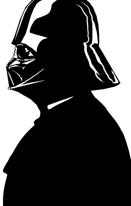
Darth Vader

I think nobody out there who hasn’t lived under a rock for the last 30 years has never seen Darth Vader. He’s a symbol for evil and probably the most famous of all Star Wars characters, if not of all (science-fiction-)movie characters.
Sure his heavy breathing and his deep, mechanical voice are a big part of what made him famous. Nevertheless one couldn’t neglect, that what most people associate with him are his black armor and his helmet.
But how many people know the roots of his famous outfit? In fact the main inspiration for the look of the dark lord of the Sith, especially for his helmet, was the armor of Japanese Samurai Warriors and a Stahlhelm, the helmet worn by German soldiers during World War II.
I think the great design of Darth Vader and the success it had is a great example for something, many designers don’t want to be true:
You don’t have to work from absolutely nothing in order to create an innovative design. Far from it! Sometimes the best and most cutting-edge designs just come from new combinations and a new and unusual point of view at existing things. There is absolutely nothing wrong about working upon things that had been proved successful. You should just keep in mind the difference between inspiration and imitation.
There’s also a great list on Geek in Heels about the inspirations for the designs of Star Wars.
Reason №2 Shape
This is something like the master-rule for good design. Whatever you do, no matter what, the quality of it will depend on whether or not it got a good and strong shape.
The first thing you see from nearly every object, no matter if two- or three-dimensional, is its shape. Judging the shape is the fastest way your brain can grasp a thing. If you can recognize an object, depends strongly on whether you can recognize its shape. This doesn’t just mean, that things with dull shapes will be harder to recognize, it also means that they will be boring to look, which will affect the design negatively.
But the sense of a good shape isn’t just to increase the recognition values of an object, it also supports the impression of it. The shape can convey if the object is large, small, fast, strong, heavy, hard and so forth. Thus making it one of the strongest weapons of a designer.
To write something about the shapes in Star Wars would be an article for itself. But I think they are self explaining anyway. Just have a look at this collection of shapes from various crafts and persons from Star Wars and try if you can recognize them. Notice especially how good some objects are identifiable from different angles.

Reason №1 Lightsabers

Seriously. Best weapon ever. Fact. Search your feelings. You know it’s true.
A little bit about me
My name ist Marcus Blättermann.
I’m majoring in communication design and work as a freelancer for illustration, print- & webdesign.
What you should do next
Don’t forget to follow me on Twitter. You should also check out my Portfolio.